Conversion Rate Optimization: How Better UX Turns More Visitors Into Customers in 2026
Getting people to visit your website is only half the job.
The real question is:
What happens after they arrive?
A business can generate thousands of monthly visitors through SEO, paid advertising, social media, or referrals and still struggle to generate enquiries or sales.
Often, the problem isn't traffic.
It's the experience.
Visitors can't immediately understand the offer. Navigation creates friction. Calls to action are unclear. Forms ask for too much information. Pages load slowly. Mobile experiences feel awkward. Or there simply isn't enough trust to convince someone to take the next step.
This is where Conversion Rate Optimization (CRO) becomes important.
In 2026, successful websites shouldn't simply attract traffic. They should systematically help the right visitors move from interest to action.
1. What Is Conversion Rate Optimization?
Conversion Rate Optimization is the process of improving a digital experience so a higher percentage of users complete a desired action.
A conversion doesn't necessarily mean making a purchase.
Depending on the business, it could be:
- Submitting an enquiry
- Booking a consultation
- Requesting a quote
- Starting a free trial
- Creating an account
- Downloading a resource
- Joining an email list
- Adding a product to cart
- Completing checkout
The basic idea is straightforward.
If 1,000 people visit your website and 20 become leads, your conversion rate is:
20 ÷ 1,000 × 100 = 2%
If improvements increase that to 40 leads without increasing traffic, you've doubled the number of conversions from the same audience.
That's why CRO can be so valuable.
2. CRO Is Not Just About Changing Button Colors
Conversion optimization is sometimes reduced to small experiments such as:
“Should the CTA button be blue or green?”
Testing visual details can be useful, but CRO is much broader.
Real conversion problems often involve:
Messaging
Users don't understand what the company actually offers.
UX
Finding important information takes too much effort.
Trust
The website doesn't provide enough evidence or credibility.
Performance
Pages feel slow or unstable.
Content
Users can't find the information required to make a decision.
Forms
The conversion process requires unnecessary effort.
Mobile experience
The interface wasn't designed properly for smaller screens.
Effective CRO looks at the entire customer journey, not just isolated interface elements.
3. Start With User Intent
Before changing a website, understand why people are visiting it.
Different users have different intentions.
Someone searching:
“What is SaaS UX design?”
is probably researching.
Someone searching:
“SaaS UX design agency”
may be evaluating service providers.
Someone visiting a pricing or contact page may be much closer to making a decision.
The website experience should support those different stages.
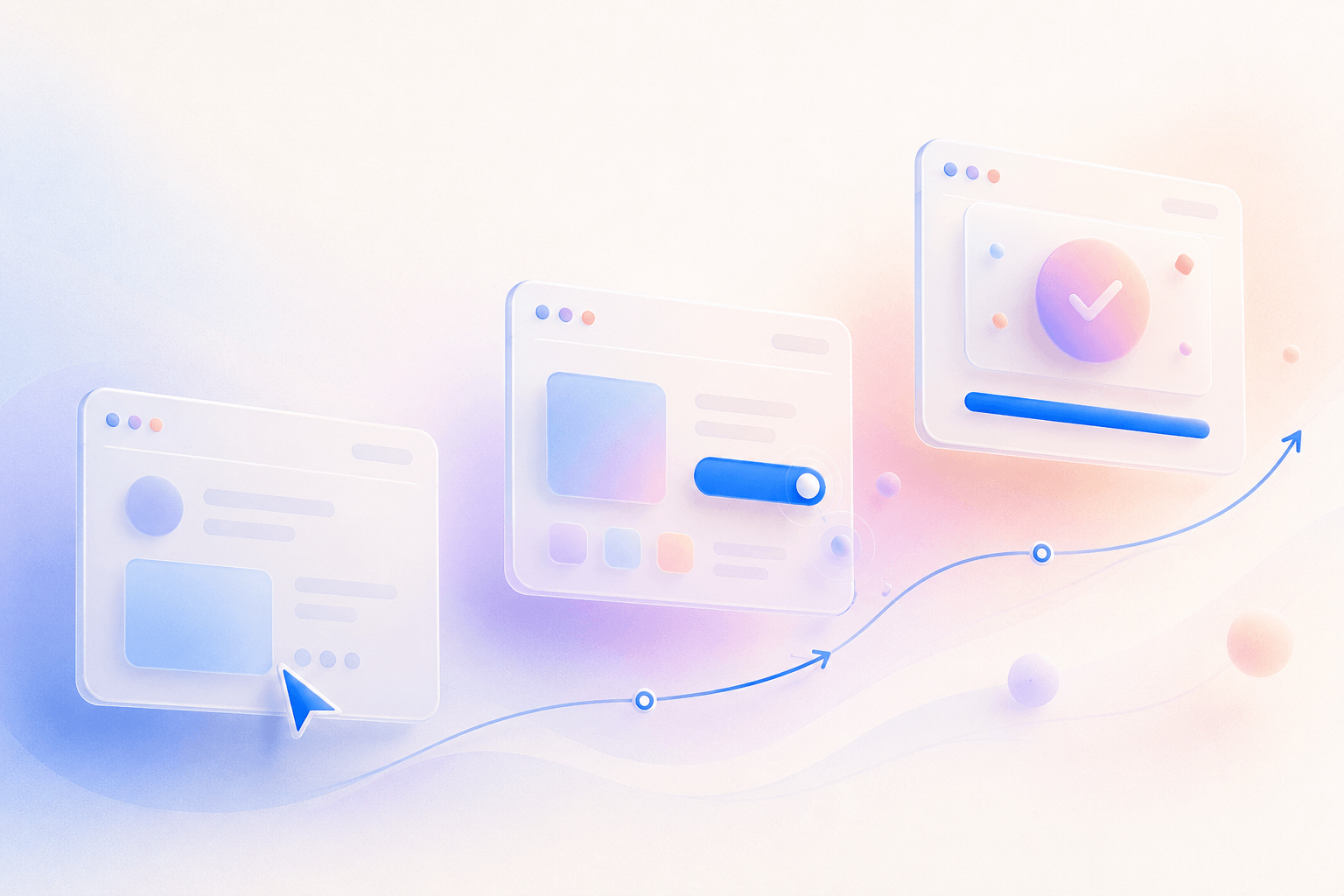
A useful journey could look like:
Discover → Understand → Evaluate → Trust → Act
Instead of pushing every visitor immediately toward:
BUY NOW
Good conversion design respects where users are in their decision-making process.
4. Make Your Value Proposition Immediately Clear
When someone lands on your homepage, they shouldn't need to scroll through five sections to understand what you do.
Your hero section should quickly communicate:
What do you offer?
Who is it for?
Why should they care?
What should they do next?
Compare:
We Create Extraordinary Digital Experiences.
with:
We Design and Build Digital Products That Help Startups Launch and Scale.
The second statement provides significantly more context.
Creativity matters.
But clarity comes first.
A visitor who doesn't understand your offer is unlikely to convert.
5. Create Strong Visual Hierarchy
Not every element on a webpage deserves equal attention.
Good UX directs users toward the most important information.
Hierarchy can be created through:
- Typography
- Scale
- Contrast
- Spacing
- Position
- Grouping
- Imagery
- Whitespace
Your primary CTA should look more important than secondary actions.
Your main headline should dominate supporting copy.
Important information should be easier to scan.
Users should naturally understand:
What should I look at first?
What should I read next?
What action can I take?
Strong visual hierarchy reduces decision-making effort.
6. Reduce Cognitive Load
More options don't always create a better experience.
Sometimes they create hesitation.
Imagine a landing page with:
Seven navigation links.
Three CTA buttons.
Two promotional banners.
A chatbot popup.
A newsletter popup.
An autoplay video.
And several animated elements.
The user doesn't know where to focus.
W3C's cognitive accessibility guidance similarly recommends helping users find important tasks easily and supporting simplification where excessive information or options create cognitive overload.
A better approach is:
One page → One primary objective → One obvious next step
Minimalism isn't about removing everything.
It's about removing what doesn't help the user move forward.
7. Design Better Calls to Action
Your CTA connects user interest with business action.
Generic CTAs such as:
Submit
or
Click Here
often provide little context.
More specific CTAs communicate what happens next.
For example:
Book a Consultation
Request a Quote
View Our Work
Start Your Free Trial
Get Your Website Audit
CTA copy should reduce uncertainty.
Users should know what they're about to do before they click.
8. Don't Ask for Too Much Information
Forms are common conversion killers.
Imagine someone wants a simple quote but the website immediately asks for:
Name
Email
Phone
Company
Industry
Country
Budget
Timeline
Team Size
Company Size
Project Type
Project Description
That's a significant commitment before any relationship exists.
Ask:
What information do we actually need at this stage?
If Name + Email + Project Details are enough to start the conversation, additional questions may be unnecessary.
Complex requirements can be collected later.
Also consider accessibility and usability when designing forms. WCAG 2.2 includes guidance around reducing redundant entry and making authentication easier to complete.
Every unnecessary field adds friction.
9. Build Trust Before Asking for Action
Visitors rarely convert based purely on a company's claims.
They look for evidence.
Strong trust signals can include:
Case Studies
Show the problem, process, and measurable outcome.
Client Testimonials
Let real customers explain their experience.
Recognizable Clients
Relevant logos can provide credibility.
Reviews
Third-party validation reduces uncertainty.
Team Expertise
Show the people and experience behind the company.
Clear Contact Information
Businesses should feel reachable.
Transparent Process
Explain what happens after someone contacts you.
A strong website doesn't simply say:
“We're the best.”
It provides reasons to believe it.
10. Use Case Studies as Conversion Assets
A portfolio shows what you made.
A case study explains why it mattered.
Strong case studies can follow:
Challenge → Research → Strategy → Solution → Outcome
Instead of simply displaying polished screens, explain:
- What problem existed?
- What did users need?
- What business challenge was involved?
- What decisions did the team make?
- What changed after implementation?
This helps potential clients imagine what working with your company could look like.
For service businesses, case studies can become one of the strongest conversion assets on the entire website.
11. Improve Website Performance
Performance and conversion experience are closely connected.
Users expect interfaces to respond quickly.
Slow loading, delayed interactions, and unexpected layout movement create friction before the user even starts engaging with the content.
Google's Core Web Vitals currently focus on three aspects of real-world experience:
LCP Loading Performance
INP Responsiveness
CLS Visual Stability
Google recommends good Core Web Vitals for both user experience and success with Search.
A beautiful website that feels slow isn't providing a premium experience.
Performance should therefore be considered part of UX—not merely a development concern.
12. Optimize the Mobile Conversion Experience
Mobile shouldn't be treated as a smaller desktop.
Think about how users physically interact with a phone.
They tap.
Swipe.
Scroll.
Type using a small keyboard.
And often interact while distracted.
Mobile conversion experiences should prioritize:
- Large touch targets
- Readable typography
- Short forms
- Simple navigation
- Fast pages
- Clear CTAs
- Comfortable spacing
- Minimal interruptions
Important actions should also be easy to find.
If users have to zoom, precisely tap tiny elements, or navigate complicated menus, friction increases.
WCAG 2.2 specifically added criteria addressing issues including minimum target sizes and dragging interactions, reinforcing the importance of accessible interaction design across devices.
13. Personalization Can Improve Relevance
Not every visitor needs the same experience.
A SaaS company might serve:
Startups
Enterprises
Product Teams
Developers
Agencies
Instead of presenting identical information to everyone, relevant experiences can be adapted around user context.
Personalization might affect:
- Recommended content
- Product suggestions
- Landing pages
- Dashboard layouts
- CTAs
- Onboarding
- Pricing information
But personalization shouldn't make an interface unpredictable or difficult to control.
W3C's accessibility guidance recommends allowing personalization while maintaining familiar, understandable interfaces and giving users control where appropriate.
Good personalization reduces effort.
Bad personalization creates confusion.
14. Use Data to Find Conversion Problems
Design decisions shouldn't rely entirely on opinions.
Analytics can reveal where users struggle.
Look at:
Traffic Sources
Where are visitors coming from?
Landing Pages
Where does the journey begin?
Drop-Off Points
Where do users leave?
Form Completion
How many people start versus finish?
Device Performance
Are mobile users behaving differently?
Conversion Paths
Which pages contribute to successful actions?
Quantitative data tells you what is happening.
Qualitative research helps explain why it is happening.
The strongest CRO programs combine both.
15. Use Heatmaps and Session Analysis Carefully
Analytics tell you that users aren't converting.
Behavioral tools can help reveal where friction occurs.
Heatmaps may show:
- Where people click
- How far they scroll
- Which elements receive attention
Session recordings can expose patterns such as:
- Repeated clicking
- Navigation confusion
- Form abandonment
- Missed CTAs
- Unexpected interaction problems
But don't interpret every individual session as universal truth.
Look for repeated patterns.
One confused visitor is an observation.
Hundreds of users experiencing the same problem can become a meaningful signal.
16. Test Instead of Guessing
Imagine two stakeholders disagree about a homepage CTA.
Person A says:
“Book a Call will convert better.”
Person B says:
“Get Started will convert better.”
Instead of debating endlessly, test the hypothesis where traffic and business conditions make meaningful testing possible.
A/B testing can compare variations in:
- Headlines
- CTAs
- Forms
- Landing-page structure
- Pricing presentation
- Product messaging
- Navigation
- Social proof
The objective isn't to test everything.
It's to identify meaningful hypotheses.
Problem → Hypothesis → Test → Measure → Learn
That's a much stronger process than:
Opinion → Redesign
17. Measure More Than the Final Conversion
The final conversion matters.
But users may take several meaningful actions before reaching it.
For an agency website, useful micro-conversions could include:
- Viewing a case study
- Reading a service page
- Checking pricing
- Watching a showreel
- Downloading a resource
- Clicking contact details
- Starting a form
These interactions help reveal whether users are progressing toward a business goal.
Think of conversion as a journey rather than a single button click.
18. CRO and SEO Should Work Together
SEO gets relevant visitors through the door.
CRO helps those visitors take action.
Optimizing only one creates an incomplete strategy.
Imagine increasing organic traffic from:
5,000 → 10,000 visitors
while the website still has confusing messaging and poor UX.
More people simply experience the same problems.
A stronger approach combines:
Search Intent + Helpful Content + Performance + UX + Conversion Design
Google itself recommends taking a holistic approach to page experience rather than focusing on a single metric or signal.
Traffic matters.
But qualified traffic that converts matters more.
19. Common CRO Mistakes
Redesigning Without Research
A visually different website isn't automatically a better-performing website.
Copying Competitors
What works for another company may not work for your audience.
Too Many CTAs
When everything demands attention, nothing feels important.
Optimizing Only Desktop
Mobile behavior can be dramatically different.
Ignoring Performance
Slow experiences create friction before content has a chance to persuade.
Removing Too Much Information
Reducing friction doesn't mean hiding information users need to make decisions.
Testing Without Enough Data
Small datasets can produce misleading conclusions.
Optimizing Metrics Instead of Business Outcomes
More clicks aren't valuable if they don't contribute to meaningful results.
20. A Practical CRO Framework for 2026
A sustainable conversion optimization process can follow six stages:
Step 1 Understand
Define the audience, user intent, and business objective.
Step 2 Measure
Review analytics, conversions, funnels, and user behavior.
Step 3 Identify Friction
Find areas where users become confused, hesitate, or abandon the journey.
Step 4 Prioritize
Focus on problems with the greatest potential impact.
Step 5 Improve & Test
Create evidence-based design changes and validate important hypotheses.
Step 6 Learn & Repeat
Use results to inform the next optimization cycle.
CRO isn't a one-time redesign.
It's a continuous process.
21. How Innowink Approaches Conversion-Focused Design
At Innowink, we don't view UI design as decoration.
A digital experience should support both:
User Goals + Business Goals
Our process can combine:
Research → UX Strategy → Information Architecture → UI Design → Development → Performance → Measurement → Optimization
Instead of asking only:
“Does this website look good?”
we also ask:
“Can users understand it?”
“Can they find what they need?”
“Do they trust the business?”
“Is the next action obvious?”
“Is unnecessary friction stopping conversions?”
The goal is to create digital experiences that are visually strong and commercially useful.
Final Thoughts
More traffic isn't always the solution.
Sometimes the biggest opportunity is already visiting your website.
The question is whether your digital experience gives those visitors enough:
Clarity.
Confidence.
Trust.
Speed.
Direction.
to take the next step.
In 2026, CRO shouldn't be viewed as a collection of marketing tricks.
It should be treated as an ongoing process of understanding users, removing friction, testing improvements, and aligning digital experiences with real business goals.
Don't just design for attention.
Design for action.