SHINE ON
Project Overview
Shine On is a household-care brand offering reliable dishwashing and home-cleaning solutions for fresher, cleaner everyday spaces.
Innowink created its complete brand identity and brand book, covering brand positioning, logo design, colours, typography, communication style, and usage guidelines. The objective was to build a distinctive and trustworthy brand that feels powerful, responsible, and approachable.
The Challenge
In a highly competitive cleaning market, Shine On needed an identity that could stand out on retail shelves, build consumer trust, and remain flexible across multiple product categories.
Beyond cleaning performance, the brand needed to represent care, reliability, freshness, and responsible modern living.
Our Approach
A Brighter, Cleaner Home—Every Day.
We combined the energy of powerful cleaning with the warmth of a trusted household brand. Every visual and verbal element was designed to communicate freshness, effectiveness, care, and confidence.
Logo Concept
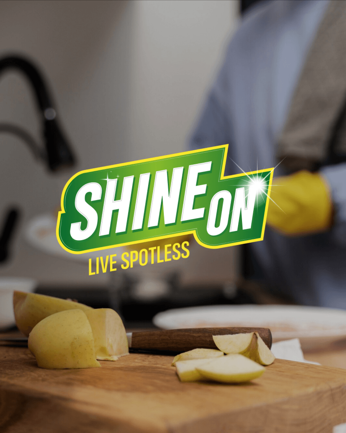
The Shine On logo communicates energy, movement, and spotless performance. Its bold, condensed lettering creates a confident presence, while the forward-leaning composition reflects action and efficiency.
Sparkle details represent brilliant results, and the distinctive connected form makes the logo memorable across packaging, retail, print, and digital platforms.
The Tagline
LIVE SPOTLESS
“Live Spotless” turns a functional cleaning benefit into a lifestyle promise—cleaner dishes, brighter surfaces, fresher spaces, and greater confidence in everyday living.
Colour System
The colour palette balances freshness, energy, cleanliness, and trust.
Primary Colours
- Dark Green — #0C6D30: Freshness, reliability, and responsibility.
- Lemon — #F8E82D: Energy, optimism, and cleaning power.
- White — #FFFFFF: Purity, hygiene, and spotless results.
Secondary Colours
- Black — #000000: Strength, contrast, and clarity.
- Dark Grey — #1D1D1D: A modern and professional foundation.
- Parrot Green — #81B92C: Freshness and an eco-conscious character.
Typography
Avenir brings clarity, balance, and readability, while Poppins adds confidence, friendliness, and a contemporary character. Together, they create a consistent hierarchy across print and digital applications.
Brand Personality
- Warm
- Nurturing
- Eco-conscious
- Responsible
- Caring
- Supportive
- Trustworthy
Tone of Communication
Shine On communicates in a warm, clear, and reassuring voice. Its language is simple, positive, and focused on genuine product benefits.
- Warm, not distant
- Confident, not exaggerated
- Supportive, not instructive
- Responsible, not preachy
- Clear, not complicated
Visual Direction
The visual identity uses clean, bright photography featuring fresh kitchens, spotless surfaces, real household settings, natural lighting, and warm everyday moments.
Brand Guidelines
The complete brand book includes logo variations, clear-space rules, colour specifications, typography guidelines, tone of voice, photography direction, correct logo usage, and packaging applications.
The Outcome
The final identity positions Shine On as a bold, fresh, and dependable household-care brand. Its energetic logo and green-and-lemon colour palette create strong recognition while communicating freshness, cleaning power, and responsible living.
The scalable brand system provides a consistent foundation for dishwashing products, home-cleaning solutions, packaging, retail materials, and future product extensions.